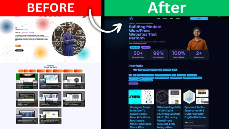
The Problem with My Own Website
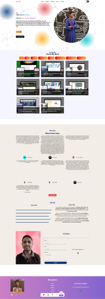
A developer’s portfolio is their most important sales asset — and mine wasn’t doing its job. The old design had the skeleton of a portfolio: a hero, a project grid, a contact form. But it had no character, no visual weight, and no sense of craft. Light background, generic layout, forgettable on first scroll. The kind of site a potential client closes within seconds.
For a while I prioritised client work over my own site — a common trap for freelancers. But at some point I looked at it honestly and saw the real problem: it looked like it was built by someone who knew how to set up WordPress, not by someone who understood design, conversion, and how to build trust online. That had to change.
What Was Wrong
The issues ran deeper than aesthetics:
- Weak first impression. The hero communicated nothing distinctive about the work or the approach.
- Template look. The colour palette, fonts, and layout felt like an unmodified free theme from 2020.
- No portfolio filtering. Projects sat in a flat grid with no way to browse by skill or project type.
- No real testimonial system. Social proof existed but wasn’t structured, wasn’t dashboard-managed, and wasn’t presented in a way that built genuine trust.
- No conversion flow. Sections didn’t lead anywhere deliberately. There was no progression from “who is this” to “I want to work with this person.”
No Premium Tools — By Choice
The entire site was built using the free version of Elementor alongside free plugins. That was not a budget decision — it was a capability one. When you have a deep enough understanding of PHP and a precise command of CSS, you do not need a premium page builder. Every feature that Pro licences charge for — dynamic filtering, custom post type rendering, popup systems, conditional logic — can be built more precisely with raw code written exactly to what the project needs.
Every advanced feature on this site was custom coded from scratch in PHP, JavaScript, and CSS — built to behave the way this business required, not the way a generic plugin happens to work. This is the difference between configuring a tool and actually building a system. And it is the same approach brought to every client project: the question is never which plugin to buy, but what is the right way to build this.
The Architecture: Custom Post Types and ACF Field Groups
The backbone of the site is a custom data architecture built using Advanced Custom Fields (ACF) free and post types registered entirely through code. Two CPTs were built:
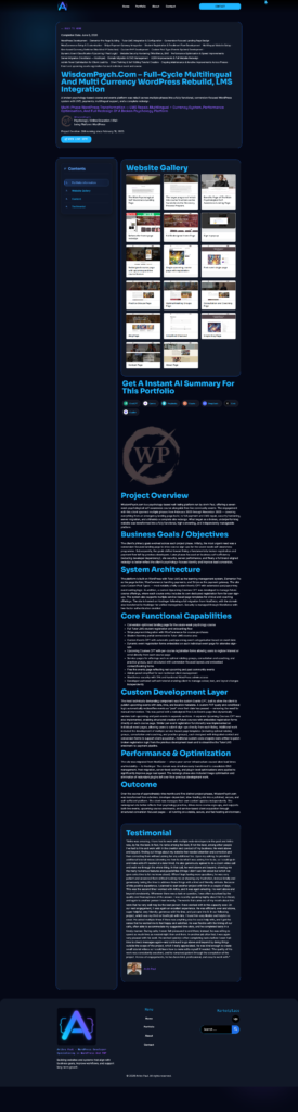
- Portfolio CPT — for managing all case studies and projects from the dashboard
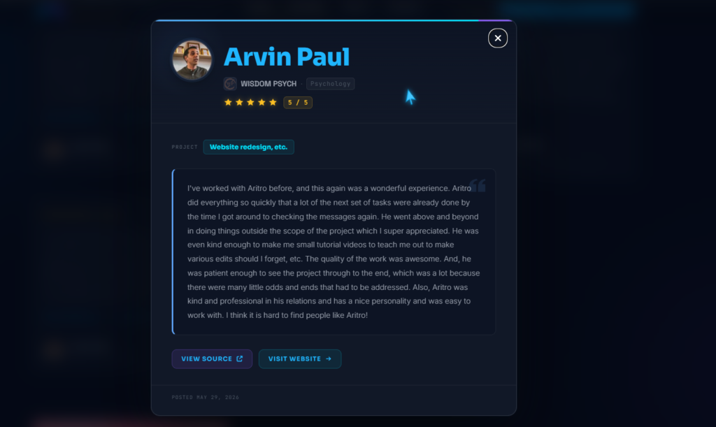
- Testimonial CPT — for managing all client reviews independently from any page
Each post type has its own set of ACF field groups covering everything the front end needs. The Portfolio CPT carries three field groups:
- Tasty Portfolio fields — core project data including description, services, categories, and skills
- Portfolio Information fields — subtitle, completion date, duration, live URL, and intro line
- Company Information fields — client name, company name, industry, and company description
The Testimonial CPT carries its own dedicated group:
- Testimonial Information fields — client name, designation, company, star rating, review text, and profile image
What this means in practice: new portfolio entries and testimonials are added entirely from the WordPress dashboard. Fill in the fields, publish, and the content appears on the front end automatically — correctly styled, correctly positioned — without touching the page editor. The site operates as a proper CMS rather than a collection of manually maintained page sections.
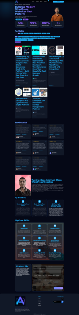
The Design: Dark, SaaS-Style, Built by Hand
The visual direction was deliberate: dark background, high contrast, sharp typographic hierarchy, and a layout that reads closer to a premium SaaS product page than a typical freelancer portfolio. Dark themes communicate intentionality and seriousness in a way light generic templates simply cannot — and when executed with precise spacing and hierarchy, they create the kind of first impression that makes a visitor stay and read.
Elementor Free was used as the layout foundation. Where its free widgets fell short of the intended design, the gaps were filled with custom CSS and PHP written from scratch. Every spacing decision, every typographic detail, every visual refinement that makes the site feel polished was deliberate — none of it came from a preset or a template.
Portfolio Filtering: Coded from Scratch
The portfolio section is powered by the Portfolio CPT and rendered dynamically through custom PHP. Two filtering systems were built entirely without plugins:
- Skill-based filtering — filter the grid by primary technical skill (WordPress, WooCommerce, Elementor, PHP, and more)
- Category-based filtering — filter by project type (E-Commerce, Service Website, Landing Page, Blog, and others)
The taxonomy registration, query logic, filter UI, and dynamic grid update behaviour were all written in PHP, JavaScript, and CSS — coded to match exactly how this site needed to work. Each portfolio card pulls its data directly from the ACF fields: title, thumbnail, category, skills, subtitle, and intro line — all managed from the dashboard, rendered cleanly on the front end.
Testimonial System: Dashboard-Managed, Popup-Enabled
Testimonials are not hardcoded into any page. Each one is a post in the Testimonial CPT, created from the dashboard with structured ACF fields, and rendered on the front end through a custom PHP template that queries the CPT automatically. Adding a new review means creating a post and filling in the fields — it appears on the site without any page editing.
The front-end display includes a custom popup system built entirely with custom JavaScript and CSS — no premium popup plugin involved. Each testimonial shows the client name, rating, and a preview in the main section. Clicking opens the full review in a popup whose behaviour, animation, and styling were all written to specification.
Core Skills and Contact Sections
The Core Skills section presents each skill with a short description written to communicate business value, not just technical terminology. WordPress is not “CMS experience” — it is the ability to build custom architectures that perform. PHP is not just a language — it is what makes custom logic possible without relying on overpriced plugins. The section was laid out in Elementor Free and refined entirely with custom CSS.
The contact section closes the page — clean, direct, and low-friction. A free contact form plugin was integrated and styled with custom CSS to match the dark UI precisely. But the contact section only works because of what comes before it. The entire page is a deliberate conversion sequence:
- Hero — positioning, credibility, and a stats row that establishes trust immediately
- Portfolio — filterable proof of work relevant to each visitor’s context
- Testimonials — social proof with full popup access, building confidence progressively
- Core Skills — a business-framed answer to “can this person handle my project?”
- Contact — a natural next step after every layer of trust has been established
By the time a visitor reaches the form, the work above it has already done the job.
The Outcome
The old site said “this person can set up WordPress.” The new one says “this person builds systems that perform” — and the site itself is the proof. Every advanced feature was built without a single premium tool: the CPT architecture, the ACF field groups, the filtering logic, the popup system, the dynamic rendering. All of it written in raw PHP, JavaScript, and CSS, fitted precisely to what the business needed.
That is what this portfolio demonstrates beyond the projects inside it. Not just the work — but the method behind it.